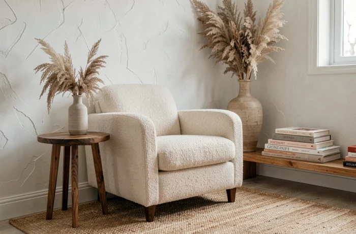
Transforming an interior into a cocoon today requires much more than just a selection of seasonal textiles. The cocooning trend has spilled over from the autumn-winter framework to become a permanent decorative lifestyle, with new demands: healthier materials, evolving colors, and increased attention to indoor air quality. The topic deserves to be explored beyond the usual advice on candles and cushions.
Formaldehyde Regulations: What Changes for Cocooning Furniture
A rarely addressed angle in decoration articles concerns the chemical composition of furniture. The European Union has introduced new formaldehyde thresholds for furniture as part of the REACH regulation. This substance, classified as carcinogenic, is found in particle boards, plywood, and certain coatings used in the manufacture of common furniture.
For an interior aiming to be a cocoon, the issue goes beyond aesthetics. A sofa, a low bookshelf, or a bedside table made of reconstituted wood can potentially emit formaldehyde for months after purchase. Some manufacturers already display very low levels, while others do not communicate their emission data.
Before choosing a piece of furniture for your living room or bedroom, checking for certification on volatile organic compound (VOC) emissions remains the most reliable precaution. Labels like the digital product passport (DPP), currently being deployed for mattresses in particular, should facilitate this verification in the coming years.
The resources available on the Scoopium home site allow you to track these regulatory developments applied to interior design.
Butter Yellow and Enveloping Neutrals: The Cozy Palette Replacing Beige
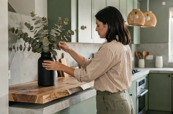
Beige has long dominated cocooning interiors. Linen walls, greige sofas, ecru curtains: the formula worked, but it is losing steam. Butter yellow is establishing itself as the key color in contemporary decoration projects aimed at warmth.
This shade is distinct from mustard yellow, which is more saturated and associated with trends from 2018-2020. Decorators describe butter yellow as bright and enveloping, without visual aggressiveness. It works particularly well in living spaces, where natural light makes it vary from warm cream in the morning to a subtle gold by the end of the day.
How to Integrate This Shade Without Repainting Everything
There’s no need to transform an entire wall. An accent chair, cushion covers, or a large vase in this tone are enough to shift the atmosphere of a room. Pairing it with raw materials (light wood, washed linen, terracotta) enhances the cocoon effect without falling into monochrome.
On the other hand, butter yellow does not pair well with cool gray. Decorators recommend combining it with off-whites or soft browns to maintain the coherence of an enveloping ambiance.
Cocooning Décor All Year Round: Moving Beyond the Autumn-Winter Reflex
Almost all competing content associates cocooning with the cold months. Since 2024-2025, so-called “summer cocoon” atmospheres are developing in interior decoration projects documented by several specialized media.
The principle relies on adjusting materials rather than changing philosophy:
- Velvet and thick wool give way to natural linen and crinkled cotton, which retain tactile softness without holding heat
- Rattan and wicker replace dark woods to visually lighten the space while keeping an organic texture
- Palettes shift from caramel-cognac to sandy, ecru, and pale terracotta tones, more suited to summer brightness
This approach changes how to conceive a cozy interior. Instead of “doing winter decor” and then “doing summer decor,” the space is thought of as a permanent base that is adjusted in layers: a light textile base in linen all year round, complemented by heavier layers (throws, rugs) when temperatures drop.
Lighting and Neuroaesthetics: Why Light Changes Everything in a Cozy Living Room
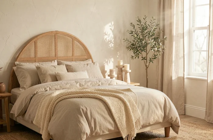
Decoration articles consistently mention soft lighting, candles, and garlands. The topic deserves to be explored a step further. The field of neuroaesthetics, which studies the brain’s responses to visual stimuli in an environment, is beginning to inform the thoughts of interior designers.
The documented principle is quite straightforward: indirect lighting positioned below eye level reduces perceived tension in a room. Uplighting floor lamps, low table lamps, and LED strips hidden under furniture create an enveloping atmosphere that a central ceiling light, even equipped with a warm bulb, cannot replicate.
Color Temperature and Comfort Perception
The majority of bulbs sold in supermarkets for home use offer a temperature between 2,700 K and 3,000 K. For a cocooning living room, feedback from professionals points towards the lower end of this range. Beyond 3,000 K, the light loses its enveloping quality and leans towards an office ambiance.
A often overlooked point: multiplying low-intensity light sources produces a cozier result than a single powerful source equipped with a dimmer. Three table lamps spread throughout a living room create soft shadow zones that add depth to the space, whereas a dimmed ceiling light flattens the room.
- Prioritize at least three distinct light sources in a living room or bedroom
- Place the main source below eye level (table lamp, low reading lamp)
- Reserve candles for occasional moments: their lively light complements electric lighting but does not replace it on a daily basis
The cocooning interior of 2026 relies less on accumulated objects than on structural choices: materials whose composition is known, a palette that works with the room’s natural light, and lighting designed by zones rather than points.